
Sometimes you just don’t know what to do with a watch… you take a punt, you think it might pay-off, you think you might be able to pull it off, but you’re not sure.
Let’s POLL!
Let’s not.
I picked up this Edox from the drop-off today. It was a Sunday eBay win, so a Tuesday DHL delivery is a very nice turnaround.
So the acrylic has a few scratches that didn’t really appear on the photos, but so far, so expected, I cannot complain (yet) about the physical condition that the watch arrived in. It was packaged incredibly well though: cardboard box, bubble wrap, big bubbles, packing nuts… in my line of work, you appreciate the effort when it’s done. You have no idea the amount of tiny boxes and kitchen paper parcels turn up; it’s an 80 year old watch, it’s not going to survive a substantial kicking from Royal Mail without at least three bulky rotations of bubble wrap.
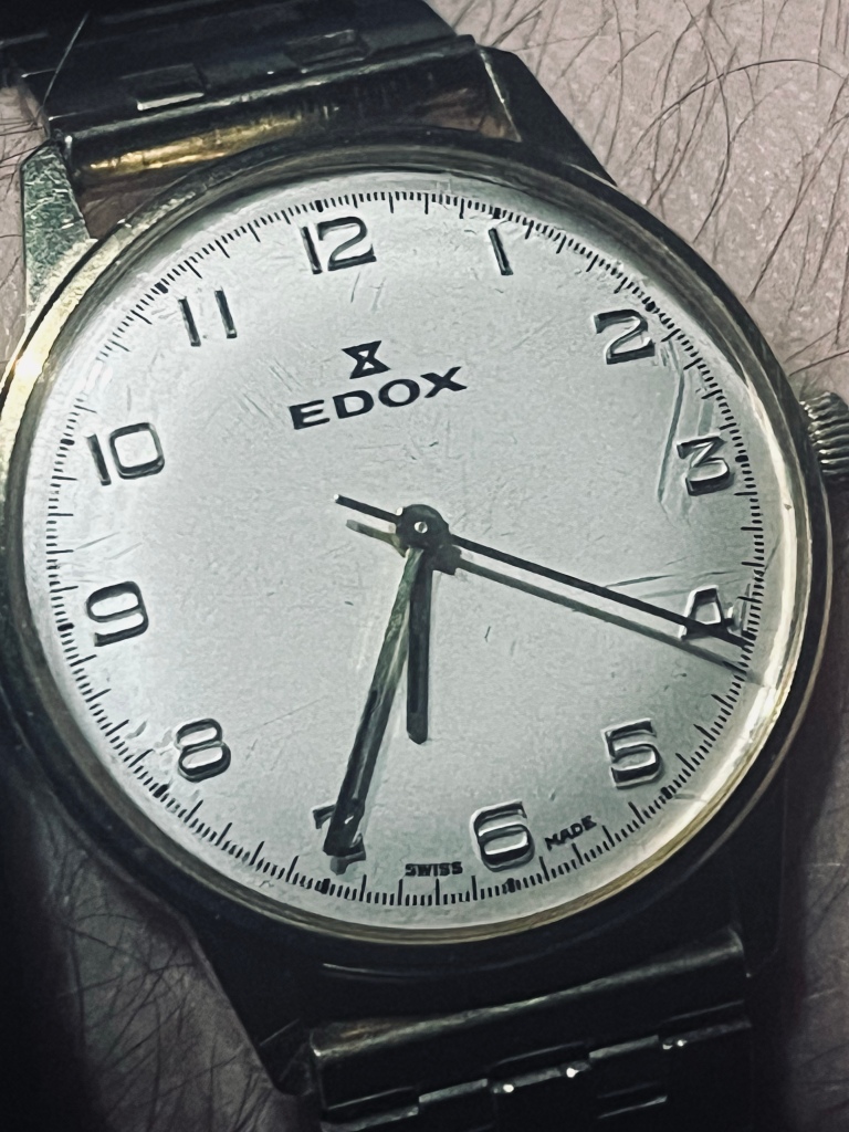
So… Edox. I’ve never really done Edox before. Their modern divers are pretty impressive, and they have some pedigree, but they don’t appear very often on my vintage travels. This is a late 60s, early 70s “dress watch”. Powered by an AS/Standard 1950 movement, it seems to be keeping good time, and the sweep seconds is smooth(ish) with a 21600a/h beat rate. The 1950 is the non-date version of this family, and I know it’s not a looker but by this point in mechanical watch making, what with quartz being around and pin-pallets being shat-out in droves, costs needed to be kept low whilst maintaining the quality. The 19×1 versions of these movements have the dates, and I am aware that these complications are actually pretty flimsy, so it’s nice to have a model that forgoes this bs. For Swiss jobbers, movement is key, and this is a solid construction. The case itself is a nice gold plate, and a stainless steel back, so far so good…
There is a lot that works on the watch – the handset and dial are in very good condition. The gold hands have an understated blue/black (hard to tell) bar in the centre for some definition. The raised numerals are beautifully filled with paint or enamel. The train track around the dial is even and pleasing to the eye. It’s a handsome watch… but I don’t get it.
The numerals are almost art nouveau. I’m not sure of the exact font, but you’d expect this sort of style in La Belle Époque; we’re not talking as late as the art deco 20s and 30s, but getting there. But it seems weird to find a vintage watch trying to masquerade as a vintage watch. It’s really meta…
I don’t think it works with the Edox logo. It’s printed on the dial, and as a result feels very flat compared to the raised numerals, and sort of sucks the life out of the piece. It’s also a very jarring juxtaposition of styles, you have these lovely flowing numerals with inlays, and just this flat, sharp, edgy, industrial tag just dumped on the dial. It’s like if they phoned it in. There is almost an element of Timex EasyReader to this, and as a result, I want the IndiGlo night light dammit!
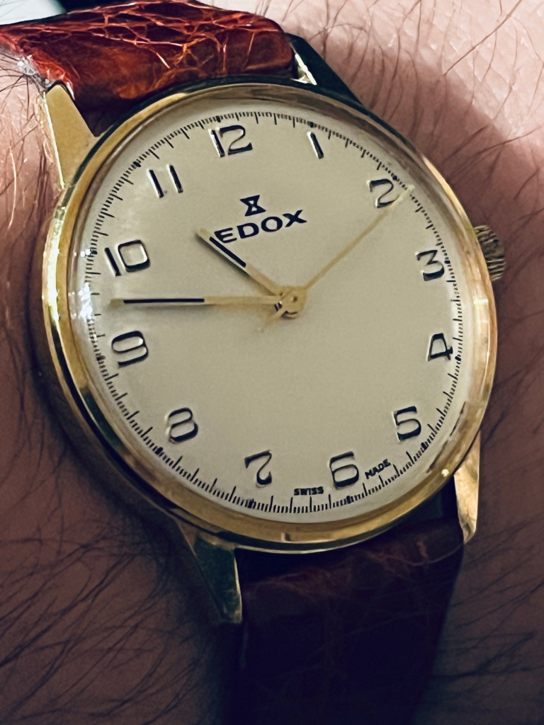
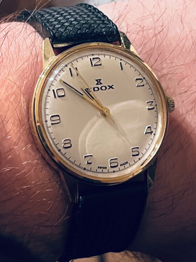
And then the other thing, as I’m moaning about the overall aesthetic, it’s the dial itself. It’s not white, it’s not cream, it’s not champagne… it’s like if we had a Venn diagram with beige, magnolia, and the slow march to death and we met at the intersect with the Dulux Sheepdog who has a overwhelming desire to just lie down in the middle of the road every 5 mins: it’s… it’s just… painfully dull. Not a sharp pain, more like an unnerving throb in the testicular region type of pain; it needs checking out but you think you can style this out until we realise it’s a hernia type of pain. It’s so dull, it doesn’t work with any strap I pair. It came with an aftermarket gold Excalibur strap (classy), it looked too understated to warrant full gold as it appeared creamy and matt. I tried this pleasant alligator strap, and it made the brown seem too red and shiny, and really cheap because it looked more white and shiny. I tried this tropical black rubber, which is sort of my goto default now, and it’s ok, but not great. It’s too light, or not shiny enough… what on Earth could work with such a terrible canvas.
I think this might just be a me problem, but I’m trying to force myself to like this watch, and the problem is that it’s not the fault of the watch; as a vintage piece it’s a f*cking masterstroke. For not a lot of money it is in excellent condition, great movement, Swiss brand with pedigree, 34mm and 18mm strap therefore excellent proportions, gold, cracking handset, excellent detailing… but it just doesn’t really work from an overall aesthetic. Logo and numerals just don’t really gel, and the dial tone is underwhelming making the whole thing a piss-coloured washout.
5/5… Douze points… Have a biscuit…
I suppose this is the pleasure and the pain side to this hobby. “If you hate it so much why did you buy it?” well it was a punt, I liked enough details to bid and unless you see it in the flesh you might not appreciate the foibles. Plus I thought a strap change might make it sing… I’ll keep trying. It’s unique, in its own confused little way. The black is growing on me, maybe a navy blue would probably set it off better, but then again, maybe not. I’m not sure anything works as well as classic black, so maybe in a week or two I’ll change my tune.
It didn’t cost much, so f*ck it.

That font is imitation “old timey.” It reminds me of the watch equivalent of the Farrell’s Ice Cream Parlours of my youth. Everyone wore a boater and red striped shirts with arm bands. It was forced nostalgia. Farrell’s is defunct now. Clean it up and see if you can make a little on eBay.
LikeLike