

Greg:
I had a weekend of travel. I will be groggy for days. Here is my topic: What is the information that you want to see on a dial and what do you not want to see? A corollary is how much is too much?
So, the starting point, for better or worse, for most people is Rolex. Are there too many lines of text? Well, yes. It is kind of their thing. If you see the world “superlative” then an editor did not do his job. But Rolex aside, I prefer less text to more. I understand the need in certain historical periods to announce certain traits. From 1968 until the mid-1980’s I think that a watch announcing that it was “quartz” made perfect sense. For that last few decades, it is not useful. When cars had mostly carburetors it made sense to announce that yours was “fuel injected”. Now, it is like saying that your automobile has “locking doors.”
One of the things that I like about vintage American watches is that they don’t brag about jewel counts or shock protection nearly as much as their Swiss counterparts. Hamilton always maintained a clean dial. Bulova caved in with the Bulova 23, but that was later. After about 1950, it was assumed that American watches were fully jeweled.

I like to see the brand. I like to see the name of model, especially in a modern watch. I don’t mind “automatic”, but I don’t want it if it unbalances the dial.
Kaysia:
I think the art of typography on dials is massively underrated. Needing to be both functional, legible and, in the case of watches, appealing to the eye.
The skill of font and word choice on dials seems most noticeable to me when you see Ali Express brands who try, and fail, to use various fonts to give the name on the dial an air of heritage. Something about some text just doesn’t work.
…And for me it has nothing to do with what the text actually says. It’s all about aesthetics to.
We don’t need ANYTHING on the dial that isn’t functional, and since I wouldn’t class any text as functional, the only reason for the brand name, logo, 200m WR, quartz etc. to be on there is to make the dial more aesthetically pleasing.
When it’s done well, it elevates the whole design wonderfully, and one great example of this is Studio Underd0g.
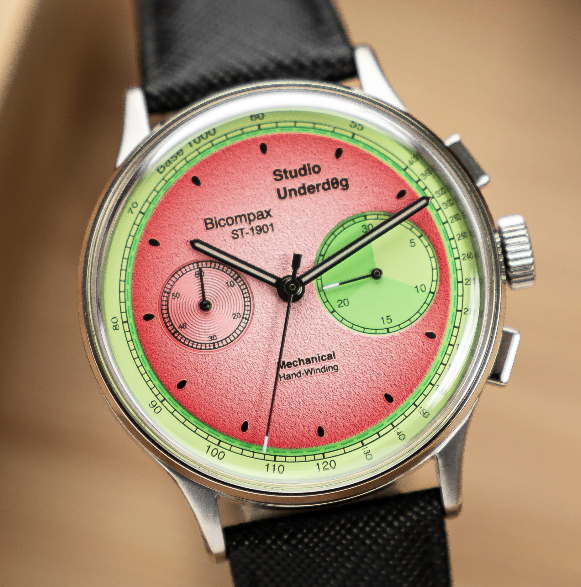
I just love how they balance the use of a simple font with off-centre placement, bold text and differing letter sizes.
I’ve seen so many pictures of these watches, but I still couldn’t tell you what the text said without looking, because it just blends into the appearance of the dial perfectly. An integral part of the design.
Another example is this lovely H.Moser. It takes dial text to the extreme, but somehow still manages to pull it off.
Text adds interest.
It’s another layer of detail to mediate on, and as long as it looks good, stick as much as you like on the dial.
In fact, this is usually not a case of ‘less is more’ in my mind.
If you half-heartedly plop ‘automatic’ in the bottom half of the dial just to balance out the logo, it feels forced. Like there is absolutely nothing more interesting to say about the watch other than ‘not a quartz’.
Go big or go home.
Give me the watch’s life story as long as it looks good.
Chris:
To be honest, I’m not sure which side of the fence I fall down. I like a clean dial, and if hungry enough I can devour a word salad. I think it just depends on what mood I’m in. Placement, however, is key.
For example, I think the Black Bay 58 text, in itself, is ok, but it just looks off in execution, and as such I’m already walking by. I like the StudioUnderd0g placement, and that already seems to have cemented itself as a design standard as we have companies like Baobab riffing off of it like freeform jazz. I like certain fonts, and dislike others. I may have an aversion to certain words regardless of how pretty they look. I dislike too much space, but I do not particularly like clutter either. I think I have effectively said little that is of note whilst also being quite aloof.
I’m partial to a good numeral though…
Greg:
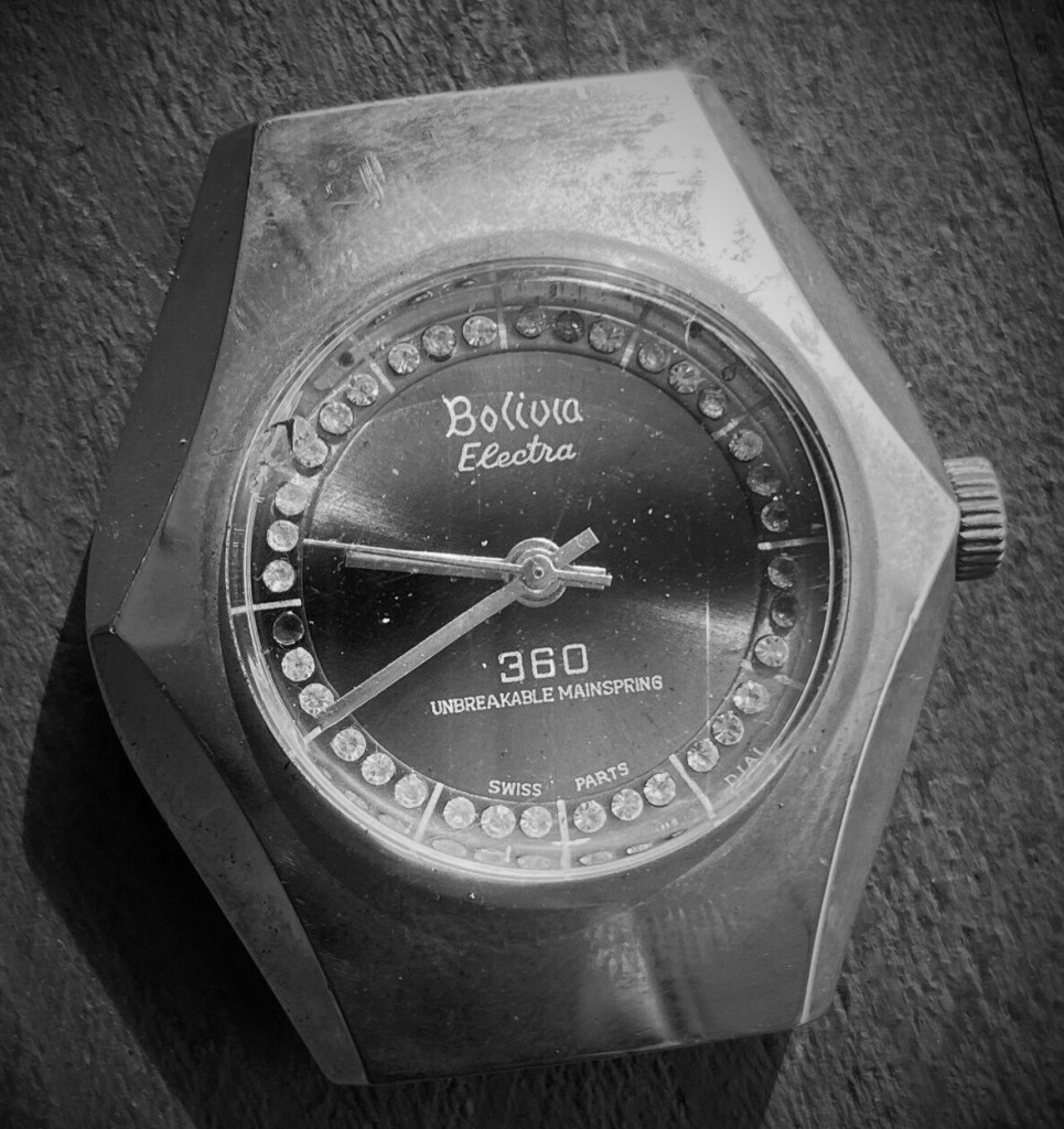
On old watches extra text can be quaint. Oh look, an “unbreakable mainspring”, that sounds impressive. “Electronically adjusted”, that must be modern because it is “electronic”. Everyone loves a “waterproof” watch, why not? A “jeweled lever” you say? I’ll buy.

But today a messy dial with too much text just seems desperate. Look at this monstrosity. Why tell us the jewel count? Who exactly are you impressing with that? The name font is borrowed from Grand Seiko. You couldn’t fool anyone with that. Grand Seiko impresses despite the font. It is the dial and lack of adornment that draws the eye.
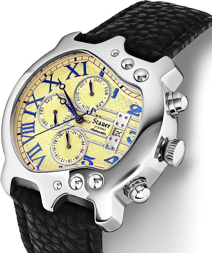
And why tell us that it is an automatic with a display case back?
Kaysia:
Considering the vast, vast majority of people who buy watches are NOT enthusiasts, how many customers actually have any clue what these things mean?
I know non-watch people I talk to have no idea what the difference is between automatic and quartz, they would presume ‘water resistant’ meant you can go swimming with it and number of jewels would only be understood to terms of: Jewels are precious, therefore more jewels = better.
Even worse is the whole ‘WR 50m’. I guarantee if you ask the guy on the street what that meant they would be saying you could happily go pearl diving with it.
So perhaps text is bad if it’s misleading.
Chris:
I think there is a whole realm of vintage where the text is misleading – there are many of the pin-pallet jobbers that state “21” or “25” on the dial, but they are often 1 or no-Jewel specials. These are sometimes also found with “Electronic” (or words to some effect implying that they were electronically timed or checked) which would imply a greater accuracy, but they were probably just bunged-in a timegrapher and checked it worked.
I suppose a vintage “Chronometer” bears as much resemblance to one after 60 years as I do to Brad Pitt. I have the makings of being Brad Pitt (human, male, brooding), but none of the execution (fatter, shorter, and less attractive, but I could deliver something desirable within this framework).
More jewels are usually a good thing to a point, but it’s where they go that is critical. Deck jewels are particularly worthless, and a pin-pallet with 25 jewels is essentially a turd rolled in glitter.

Great article, I had an impulsive answer but I took a minute to let it marinate and here are my two cents.
I don’t believe spec information should be on the dial… that’s what the back case is for, and if it’s see through then the back outer rim (case). Brand and model should be the must unless if writing is part of the conceptual design of the watch. Made from is usually a very fine print placed at the bottom of the dial so that doesn’t really distract.
The point is if there are functions on the dial, you need to be able to decipher it without being impeded by other information. “Less is more”.
LikeLiked by 2 people