

Greg:
Are there any burning issues that need to be addressed? Here is my late night thought: Not all “vintage inspired” pieces are the same. What makes one work and one not? I am thinking of a Timex/Todd Snyder collab up on our favorite forum. It looks like any number of mid-century watches, but this one bugs me.
Chris:
I’m feeling very singled-out here 🙂
I think the simple answer is with the buyer. I bought one of those Todd Snyder field watches, and I gave it to my nephew more to save face rather than try and explain to my wife why I bought yet another field watch. He likes it. I like it.
I have just picked up a Timex x YMC MkI collab from a few years back for peanuts. Unworn in box, new battery required.
I guess the most egregious one would be the Spinnaker Wreck v2. I have one inbound from Norway, and yes, it is contrived. It might not be as contrived as, say, a Christopher Ward Ombre, with its hand-scratched dial, but it does really take the faux-patina baton and run with it. I think it looks fine; I’d rather wear this than a Black Bay.
I have others – the bleached Panerai Luna Rossa faux-vintage, the Maharishi x WMT 1950s Bubbleback… I am guilty of this crime.
I like vintage watches with stories and scars, it sometimes helps though that after a bad run of form you just want a watch that works out of the box. It also helps to confirm whether or not your vintage flight of fancy will work for you. Gateways.
Greg:
Don’t everyone jump in at once. (Time passing… And this is why this post is not a Round Table. It has but two legs.)
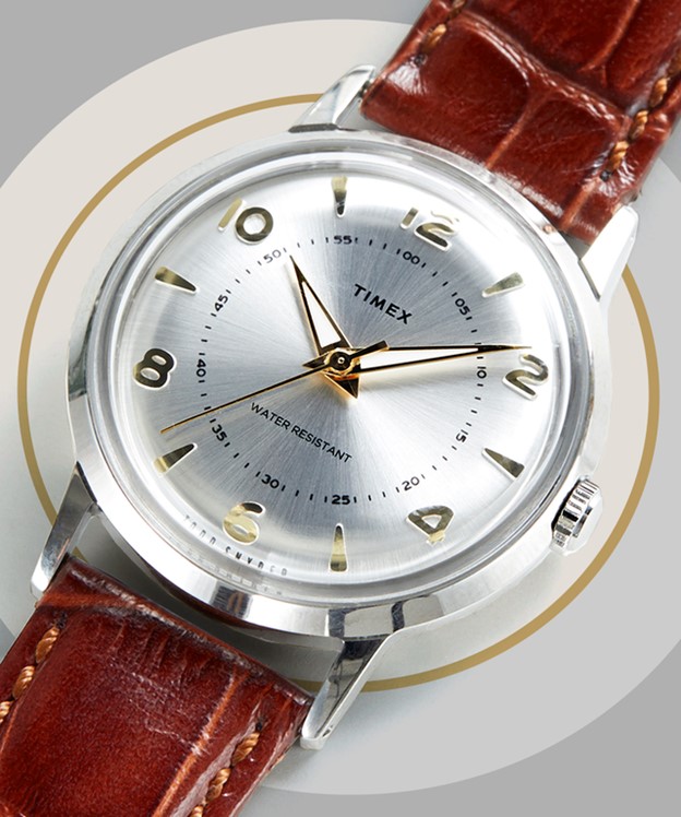
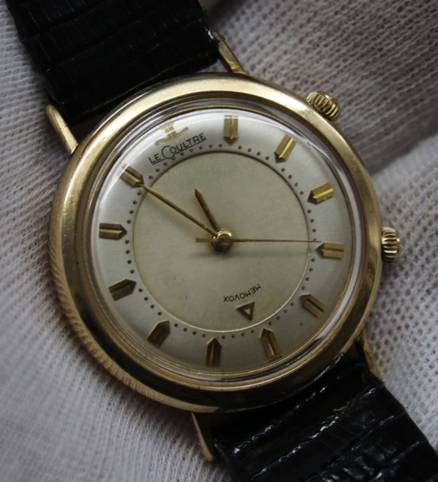
The watch that I am talking about is the Timex/Todd Snyder Welton. So, the story is that clothing and lifestyle designer Todd Snyder remembered his father’s old Timex Mercury and he updated it for a modern look. I have to say that it looks better than the original. I have a problem with the inner track however. He updated the inner track with numerals to make time keeping more accurate presumably. But, is that really their purpose? Do they have a purpose at all? The inner ring on this style of watch usually was the line of demarcation for the hour hand, or if accuracy was required, the minute or second hand. A track is supposed to help guide the eye and allow for more accuracy. If a general sense is all that is required, then we can have a Movado Museum Watch sort of experience. Here are two photos of vintage watches with an inner track. See how it can be used. I would not nominate the Wittnauer for any sort of design award, but the minute and second hands easily measure. The LeCoultre is more stylish, but again the track is useful.

On the Snyder collab the minute and second hands wander to the edge of the watch. There is no track out there. To use them with the inner track you have to stop halfway up the hand. Your eye won’t let you. That ‘s not how you use a watch. Does Snyder know that?
He either doesn’t know or doesn’t care. This detail lets you know that this watch is all for show. Don’t bother winding it or setting it. It is just a bracelet, a bangle or bauble. Once you see the futility of the inner track you can’t view this watch seriously anymore. Or at least I can’t.
Chris:
Well if it’s the Mercury he was referencing, he cocked that up.
I have been too busy messing around and criticising my Luninox for me to notice the Welton. That is a mess. I thought you were just railing against Mr Snyder in general…
I agree, that is a fundamental design flaw in reading the watch, which is a shame as if carried out well then it would work well. The Mercury had an outer minute track, but I do know that the MkI has the smaller 24 hours just below the main numerals. This might be a bit of trying to be too clever; the wheel does not need reinventing, so too the watch.
In terms of inner tracks, my beloved Smiths DeLuxe also pulls this off well. It’s a classic look. I don’t understand why he wouldn’t just smash something like that out with a bit of a pie pan like other Mercury models and clean up? Am I missing something?
What modern reinterpretations do you think get it right?
Greg:
I appreciate you trying to turn the conversation into something constructive, but I have one more jab to throw. The Liquor Store watch should be inspired. It is what let him really leap out of J. Crew. (30 years ago I wore my share of faded olive green wear from J. Crew. I have since devolved into slovenly old man couture.) The Liquor Store watch is boring. I know that it is being pitched at a different market than me, but….it is green or white, and has Arabic numerals, all of them. That’s it. Full stop.
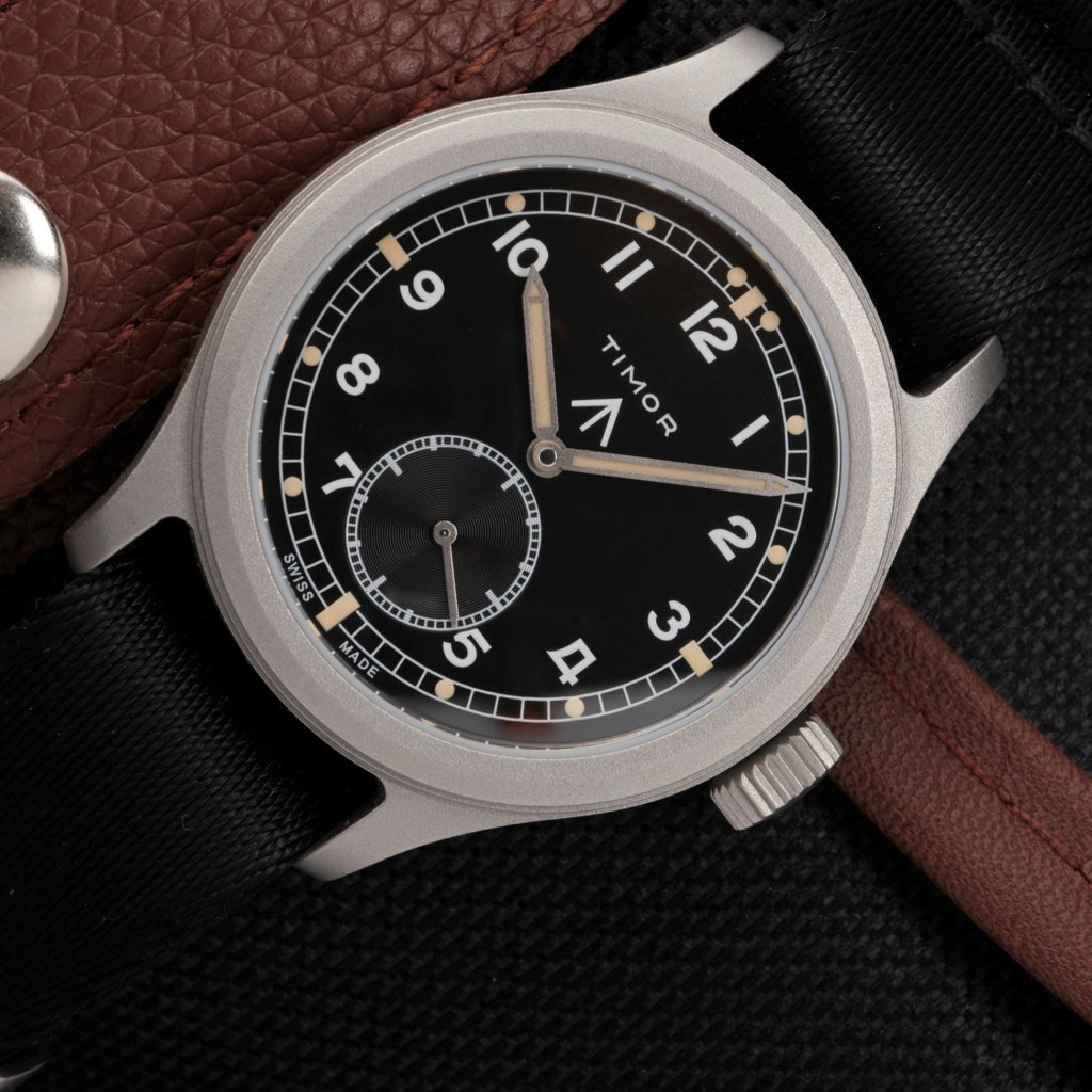
Who does it well? Right up your alley (or it was) are Vertex and Timor. To be honest, I think that the Vertex field watch looks better, but for the price I know that I would buy the Timor 10 out of 10 times. Or I would buy a Kuoe Old Smith and put up with a mineral crystal. I really like the look of the Nivada Antarctic Spider with the silver dial. It is spot on mid-century modern. It is probably nearly unreadable, but damn, it is stylish. Vulcain and Excelsior Park make beautiful watches as well. I don’t know if I could justify a Vulcain from a value for price perspective. Or maybe I am just cheap.
Chris:
Throw more – it’s fine. There’s just us two here.
I agree with Timor – their WWW and ATP reinterpretations are spot on, and are only slightly bigger with an element of improvement from a specialist.
I like Vertex – I think they are modern interpretations done well, and the brand has stayed within the family.
I always throw Kuoe Kyoto into the mix; the fact that they are 35mm are amazing as well, they really went full-on vintage there. I love their watches, and maybe, one day, I will actually bother buying one.
Vero make an amazing old-school inspired field watch called the Meridian which is 36mm.
Dan Henry. The 1945 is just amazing, but all of the others are very wearable modern versions of stone cold classics.
Undone. Surprisingly, they did a version of a Weems watch in the Aero that could be found cheap. I missed one a while back, because I was trying to be good, but it haunts me.
If you want to be “cheap”, I think Baltany and Merkur make incredible looking “vintage” watches.
I think a lot of major brands get it right – Longines, Montblanc, Tag Heuer to a certain extent. Tissot have that nice-looking 1940s chronograph. Omega have a few older-looking pieces. I’d argue the Hublot Classic Fusion is a modern MDM Geneve. That’s a 40-year old watch design. What do you think about the new Timex Marlins? I don’t think I have asked you that?
Greg:
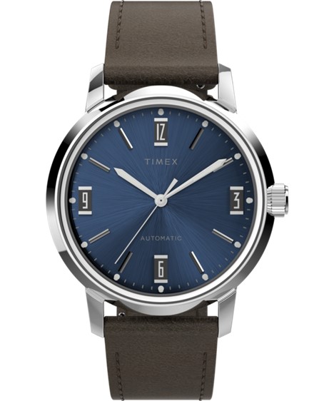
You mean the ones with the numerals in black boxes? Meh. That’s all I can muster. Meh. I don’t have the same Timex nostalgia that many Americans have. In their lifetimes Timex was the American watch. It survived. Timex took very few design chances. It doesn’t look “timeless”. It looks dated. I will close on a positive. The Snyder MK1 works as a design. The black/white split dial catches your attention and reminds you that this really isn’t a field watch. It is an accessory that tells time in field watch form. It draws attention to itself. Most field watches are understated. This design subverts the form.

Chris:
I’m not a fan of the Martin either – for the same reason, it just looks tired. Maybe it looks better in the flesh?
I gave my nephew the black-dialed military Snyder, not the Mk1. I think it is a nice watch. Perhaps we should get in on a TER collab with someone, put our money where our mouths are?

All watches would be all vintage in due time anyway… 😁 why rush the process…
LikeLiked by 1 person