

I have been involved in several arguments about two casual terms that we often apply to watches: Art Deco and Bauhaus. The problem seems to be that the terms are amorphous and apply to architecture and interior design somewhat differently than they do to watches. Art Deco buildings had largely stopped being built when Art Deco watches were just taking off. Bauhaus was about function dictating form but also involved cost savings from the standardization of the mechanical process by which they were made. Bauhaus anything was meant to be mass produced and affordable. This is where Braun is Bauhaus and Junghans is not.
My real interest in watch design is what comes after Art Deco and Bauhaus, for lack of a more descriptive term I will call it Mid-Century Modern. This is where the fusty art colony Bauhaus ideas came to full fruition. And what century you ask, well the 20th century, of course.
“Back in 1899, when everybody sang “Auld Lang Syne”
A hundred years took a long, long time for every boy and girl
Now there’s only one thing that I’d like to know
Where did the 20th century go?
I’d swear it was here just a minute ago.”
-Steve Goodman, “The Twentieth Century is Almost Over”
When Steve Goodman wrote that song the century still had nearly twenty-five years left to go. But by the 1970’s the nostalgia for the recent past was already creeping into the popular culture. The 1970’s closed a period of watch design too. This was an era where function did not dictate form: where large cases and bright colors began to dominate. Sports watches came into their own. Skin divers begat real divers. Ugly became beautiful, or at least we pretended it was. (All 1970’s Gerald Genta designs are an acquired taste; more power to those who acquired it.)

(Do I have a white dial problem? Emphatically no.)
Recently, I have been focused on those post-war years of watches. The designs were clean. The hands transitioned from dauphine to baton or stick. The dials were readable. The ideals of Bauhaus found their fruition in generic (or at least common) Swiss, French, and even American watches. Unlike anything touched by Max Bill, these were the watches of the people. It was a small window, perhaps a decade, before Vietnam, psychedelic music, and the Omega Geneve Dynamic swept it all away. (Ok, it did not all get swept away. Tano Tanaka kept it alive in Seiko design. Think of Grand Seiko with dauphine hands and stick indices, the design language is early 1960’s, but with state-of-the-art technology to polish it and drive it.)
But green shoots people, there is a movement afoot to bring back some of this swinging style. I am encouraged by recent releases by some brands, and I thought that would highlight them. So, for all those who want Don Draper styling with modern specifications, look over here:
The Big Boys

Citizen Tsuyosa
There is a reason that this line was one of the biggest releases this year. I specifically picked the plain vanilla version, but that is classical mid-century styling right there. It is a shame that Citizen is still addicted to large cases.
https://www.citizenwatch.com/us/en/product/NJ0150-56A.html?cgid=mens
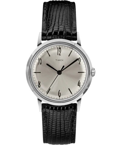
Timex Marlin
The size is right. It is a perfect recreation of a classic watch. Is it like seeing your favorite band play their greatest hit? Sure, but is that so bad?

Oris Artelier S
Oris is marketing this at women. They only show women modeling it. But has a 38mm case. Maybe it is just a watch, and anyone can wear it. Why play these gender games Oris?
https://www.oris.ch/en-US/product/watch/artelier/artelier-s/01-733-7762-4054-07-5-20-69FC
The Little Guys
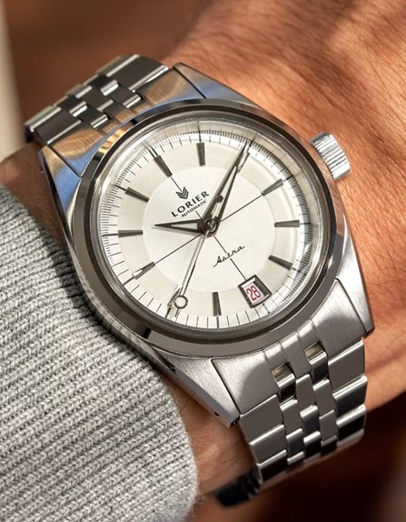
Lorier Astra
Lorier wears their influences on their sleeve (watch pun, the best kind). They consciously are harkening back to the 1960’s here. Good. More please.

Trematic Archivio Uno
A vintage watch with modern specs. You all say that you want that, well, go get it.
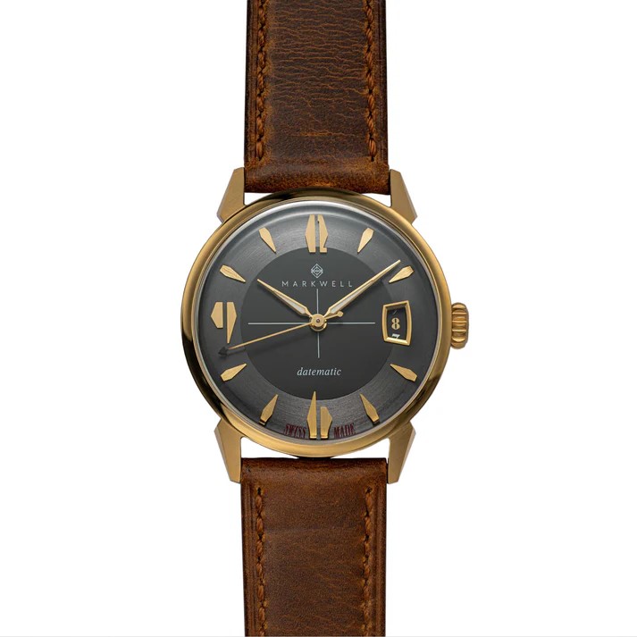
Markwell Datematic
The numerals are playfully oversized. It has a readable date window. The case is 37mm which is in the Goldilocks zone for those who love vintage and modern watches. 37mm should be more common. The dial draws inspiration from the 1950’s with dagger indices and dauphine hands: chef’s kiss.
These are all more or less affordable (a stretch with the Oris). They show that good mid-century watch design has some life left in it.
(This is styled as a “guide” because I am an engagement whore. Before Kaysia was taken by aliens, she wrote a guide for buying watches for ladies. It is our most viewed post by a country mile. I am not in any way jealous of that fact. Why do you ask?
The top photo is of Dulles International Airport outside Washington DC. It is a marvel of mid-century design, a better building in theory than in reality.)


I find it interesting that midcentury furniture is generally ghastly whilst the eyewear and watches are at peak form. I agree that Braun, imperfect as it is, hits the mark much better than the other German uglies that manage to be barren and soulless while also overdone and too dear.
The buyer should beware that there is also a giant automatic version of the Marlin that I consider to be an utter travesty but which some people seem to deliberately seek and purchase.
LikeLike
I like the look of a good amount of mid-century furniture. Time has not been kind to many of the materials, laminates have split and plastics have become brittle. But I still like the aesthetics and idea of much of it. It is rarely comfortable, however.
The large Marlin has the inherent flaw of all large watches: it is too large.
LikeLike